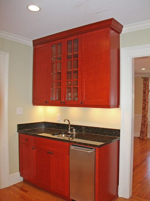
Here are a few more pictures of the house renovation that include the hallway between the kitchen and dining as well as our master bath. For the bar area, we kept the layout the same, but added a wine cooler and new cabinetry. I'm not a fan of exposed 'stuff' for the sake of it looking like clutter so really wanted tall cabinets to replace the open shelves. And, you can also see the cooler wall color of Benjamin Moore's "Paperwhite" for the walls and BM "Super White" for the trim and BM "Decorator's White" for ceilings. Floors were refinished and stained in a Durostain's "Walnut."
BEFORE:
AFTER:
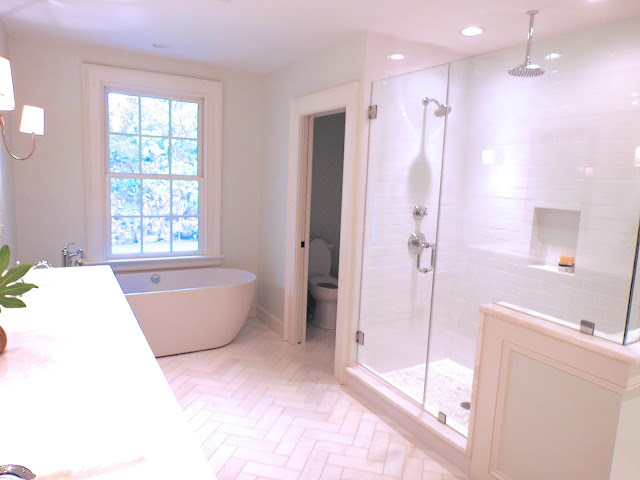
For the bath, well, that took a bit more thought. The existing space had a corner shower that felt like a dungeon, a big jetted tub with surrounding blue and gray/white tiles, a floor-to-wall cabinet right inside the door and little privacy for the loo. We did our best to open up the space and use existing plumbing lines. Floors were custom cut marble and placed in a herringbone pattern. Marble for the shower trim and vanity counters is Bianca White. Lighting by Visual Comfort.


