A Marble State Painting available here.
Saturday, August 23, 2014
Featured in Better Homes & Gardens
What a surprise it was when I opened up the September issue of Better Homes & Gardens to find one of my paintings featured in the Southern California home of Andrea & Ricky Schroder. Yes, you read that right, as in celebrity Ricky Schroder from Silver Spoons and NYPD Blue. In the article, "Surf's Up," interior designer Andrea wanted the 'inside and the outside of the house to read ocean.' Andrea ordered a print of my painting "A Marble State" from One Kings Lane and turned it on the vertical to adorn her ocean view dining room. She commented that she like how the design of the painting looked like waves. To purchase your own canvas print or framed print of this painting, click here.
Monday, July 14, 2014
The Latest in Artwork
Friday, July 11, 2014
Taking a Stroll: Window Boxes
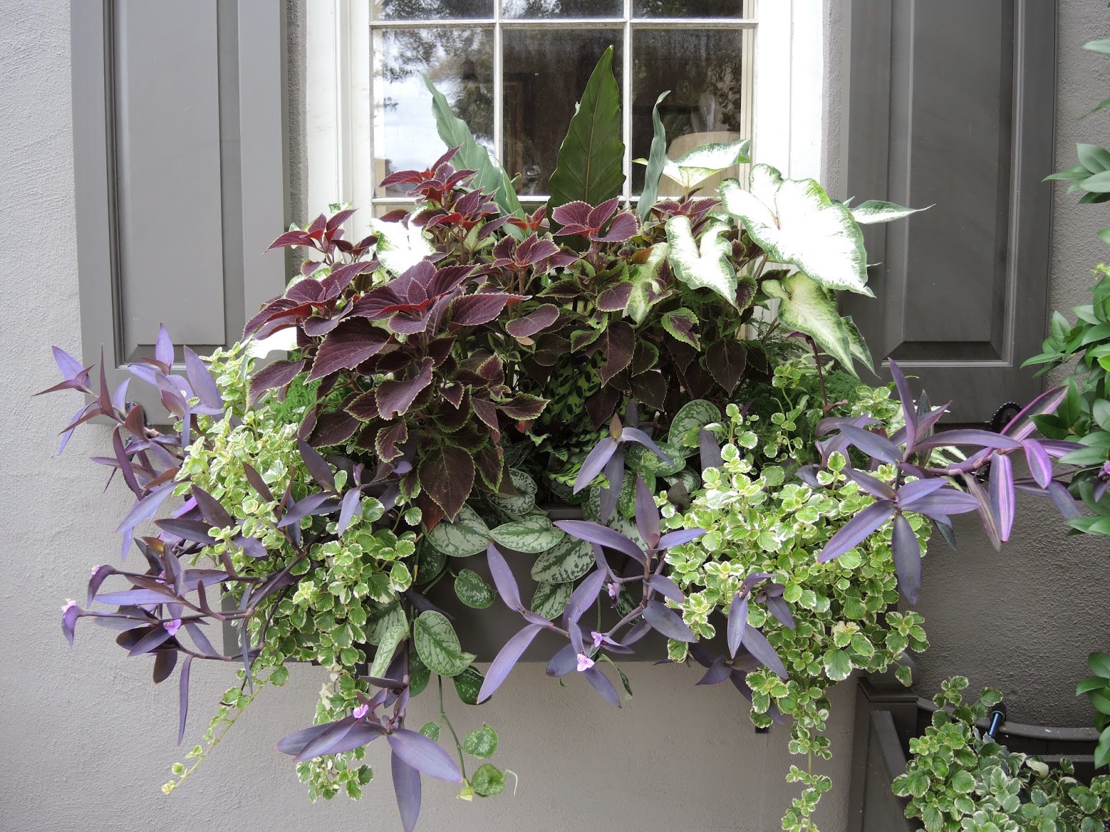
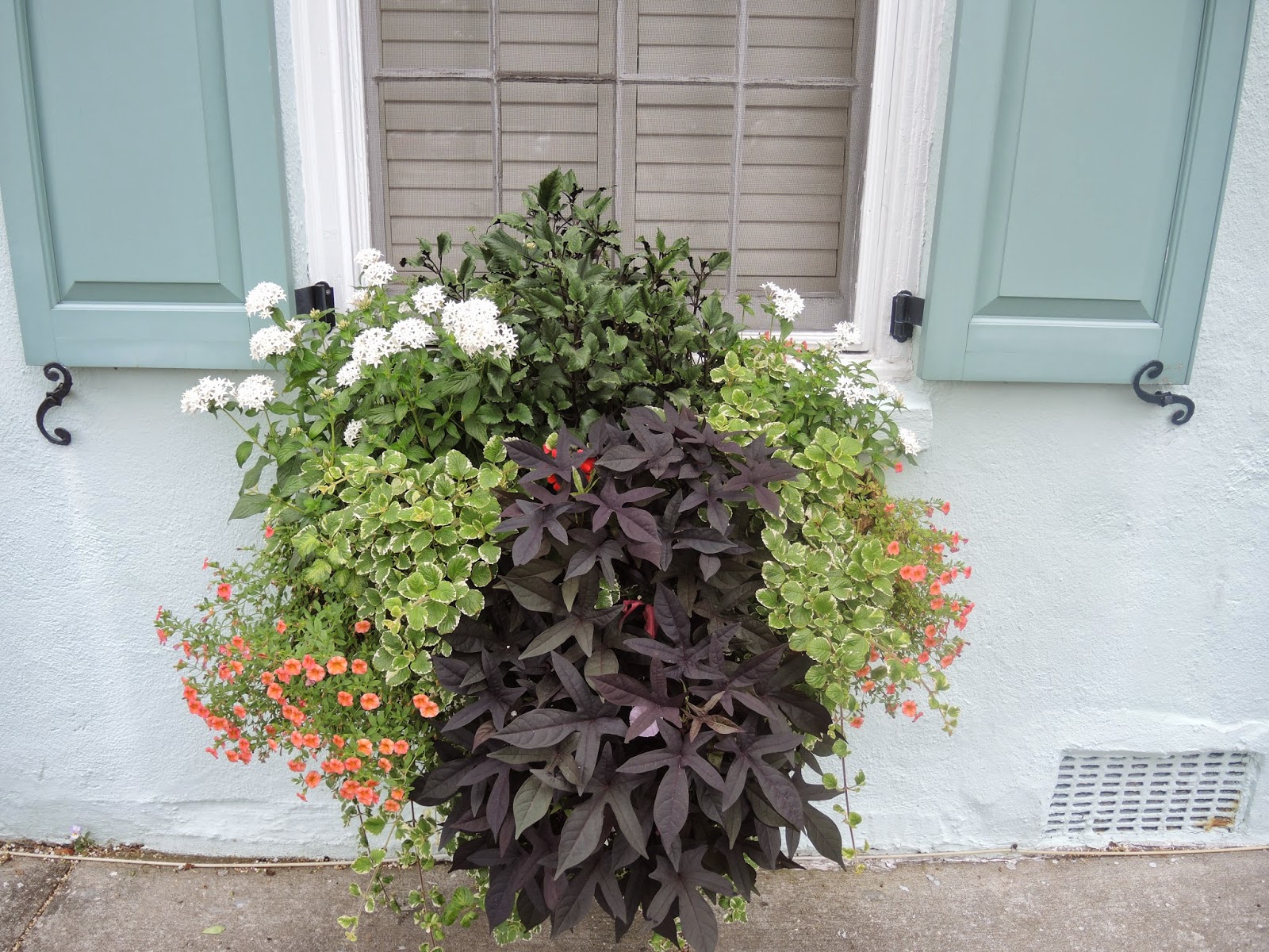
Charleston has the best window boxes around, hands down. We strolled through downtown the other day and I decided to take a few snaps. Shade or sun, there are a variety of inspiring boxes for an entrance planter or window.
Simple window boxes that work in a modern or traditional setting used to be hard to come by. I love this box for its simplicity. Sleek with a faux lead finish, this is made of lightweight fiberglass.

This window box has some really great features.
The Lechuza Balconera Cottage Self Watering Window Box is rustproof, weatherproof, hangs from walls or rails + can be floor planter, has pull-out liner making switching plantings easy, and a water reservoir to extend time between feedings. Window boxes dry out QUICKLY, so this is nice because you can monitor the reservoir levels as well on its indicator. The list of pros go on for this planter.
Simple window boxes that work in a modern or traditional setting used to be hard to come by. I love this box for its simplicity. Sleek with a faux lead finish, this is made of lightweight fiberglass.
I really like the look of this box/planter meant to look like stone, yet made of lightweight plastic.
Since boxes dry quickly, watering is a constant task unless you buy the self watering box I included at the beginning of this post. This hose has been a great purchase. Space saver and easily expands to a long length.
A few others for inspiration:

Sunday, June 22, 2014
Ranch Renovation
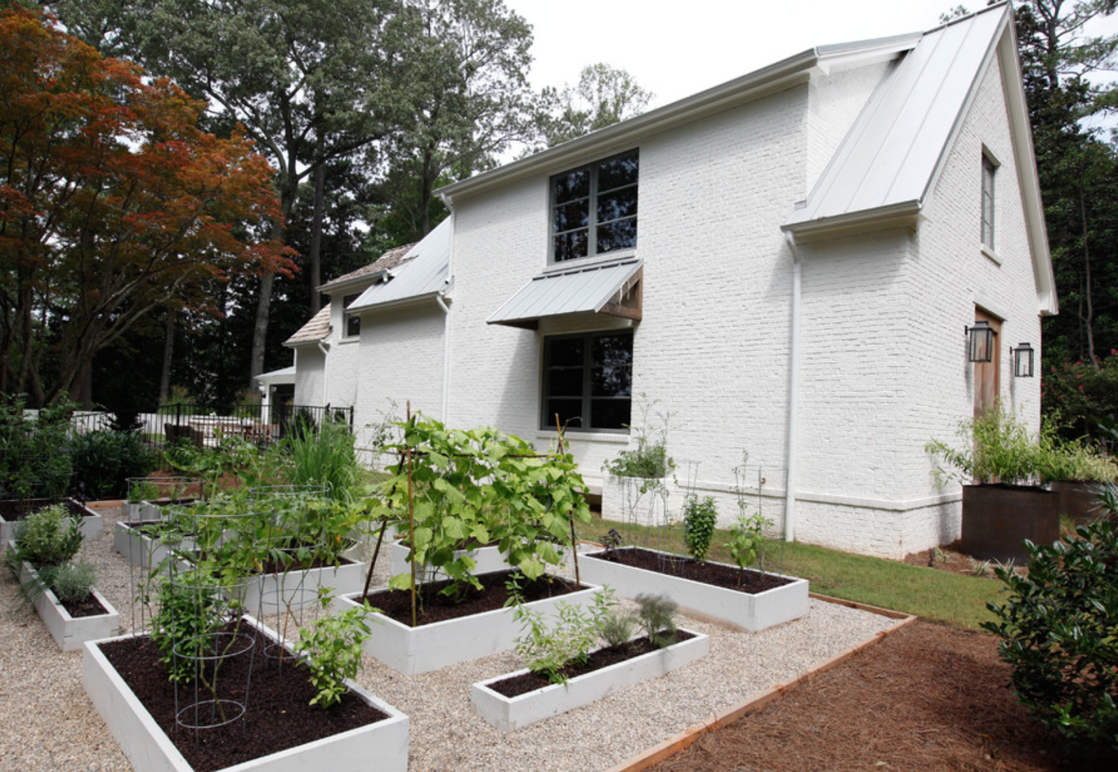
Ranch homes pose such as challenge to a homebuyer or current resident. Many people like one story living, and opening up the existing space by removing some walls works for them. For others, the low ceilings, flat roof line and rectangular space just doesn't work at all. To eye a standard ranch and figure out what to do next is hard. Here are a few ranch homes that were adjusted to two story living...both contemporary and traditional styles. Hopefully this gives you some inspiration on what you can do with a simple rectangular space for exterior visual appeal.
I love this house because they broke up the front facade with a porch, various roof heights, entranceway, etc. Too many people just cut dormers into the room leaving everything else intact. This shows you that you can do so much more!
For a ranch that is brick, it doesn't mean you are stuck doing brick on your second story. I look the cedar shake siding and eyebrow on the roof.
With metal roofs all the rage, you can take a 50's-60's ranch and modernize it. This looks like it was built this way.
Option of just going up in the rear of the home.
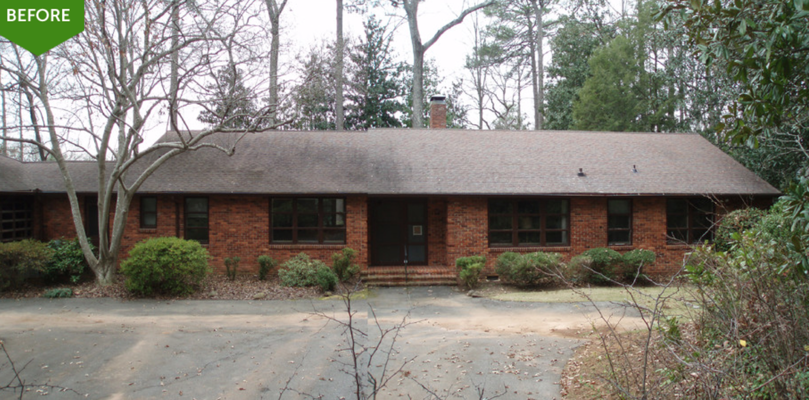
Several photos of this house below. Here is the before. Ouch.
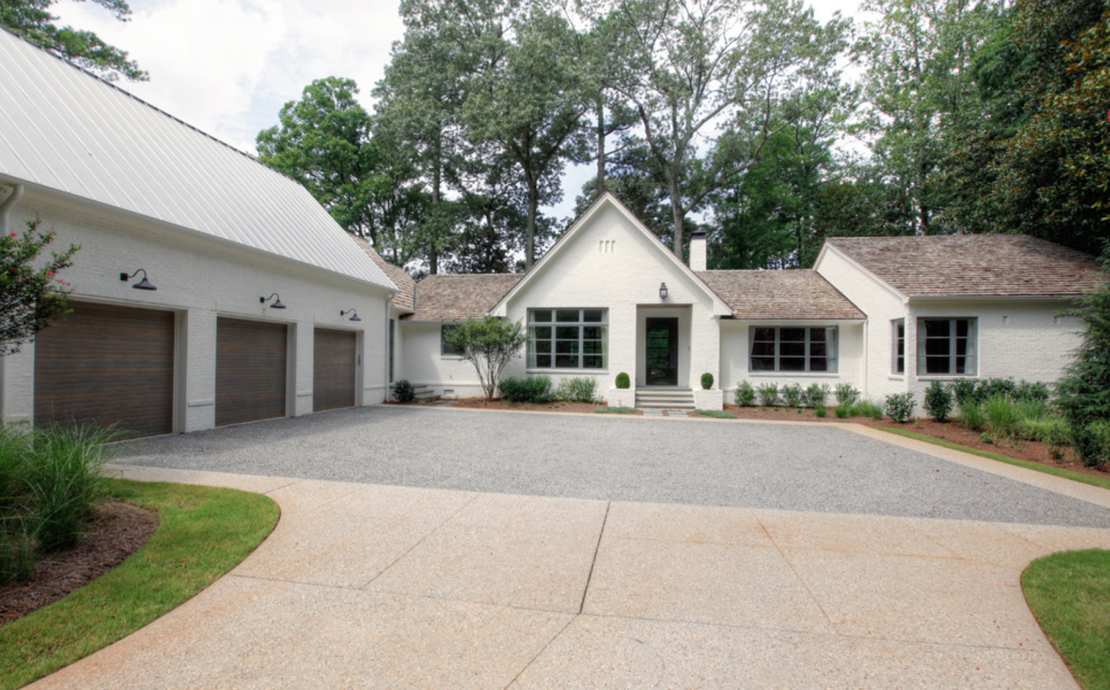
The front of the house after. Obviously this person loves their cars. The garage is a little oversized in my opinion to the house, but the house itself looks fantastic.
The rear of house.
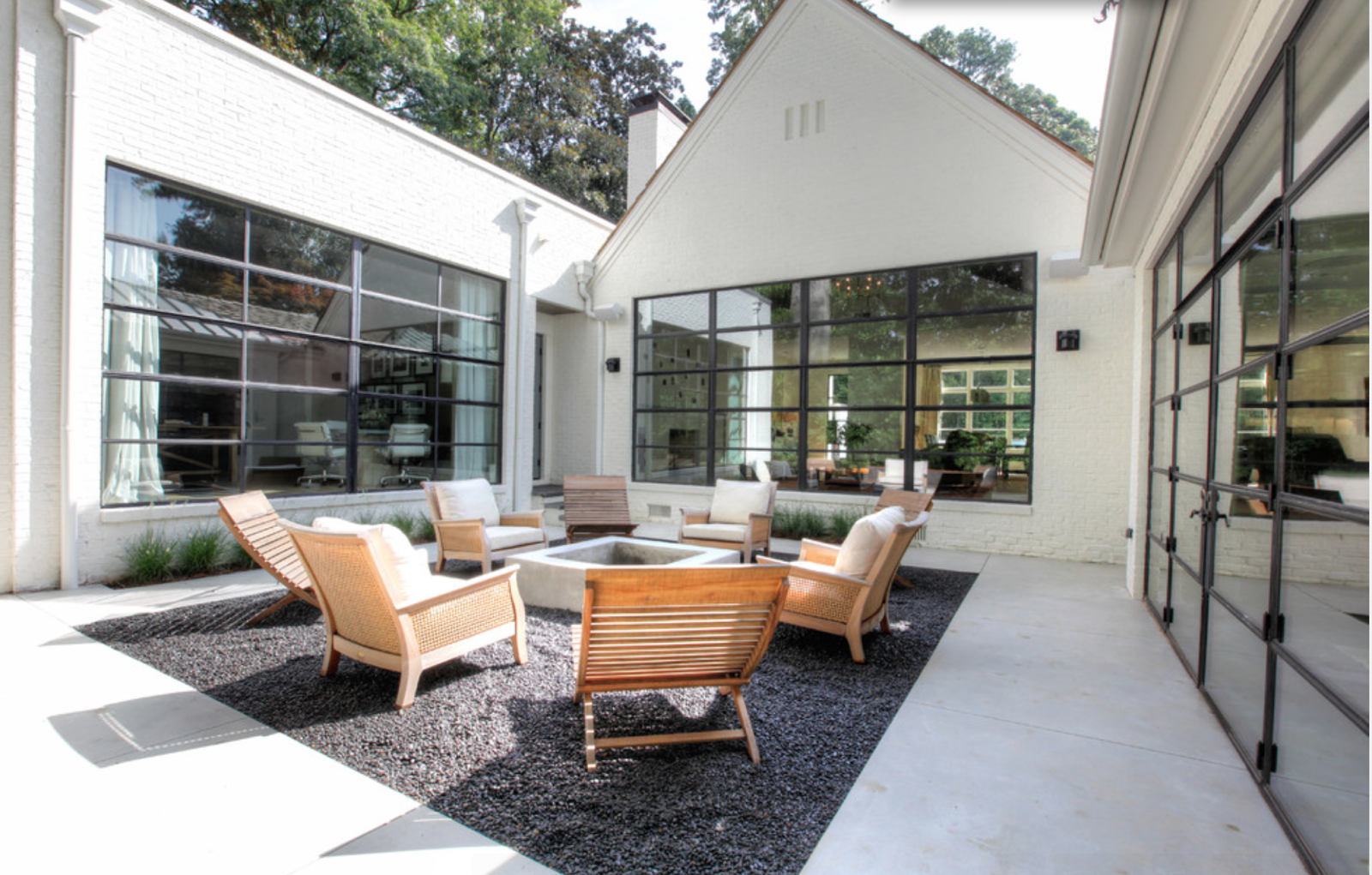
Courtyard in middle shows all the light flowing into home through the large windows and rollaway glass doors.
Landscaping doesn't look like it had been done yet, but a nice traditional 2nd story addition to this ranch.
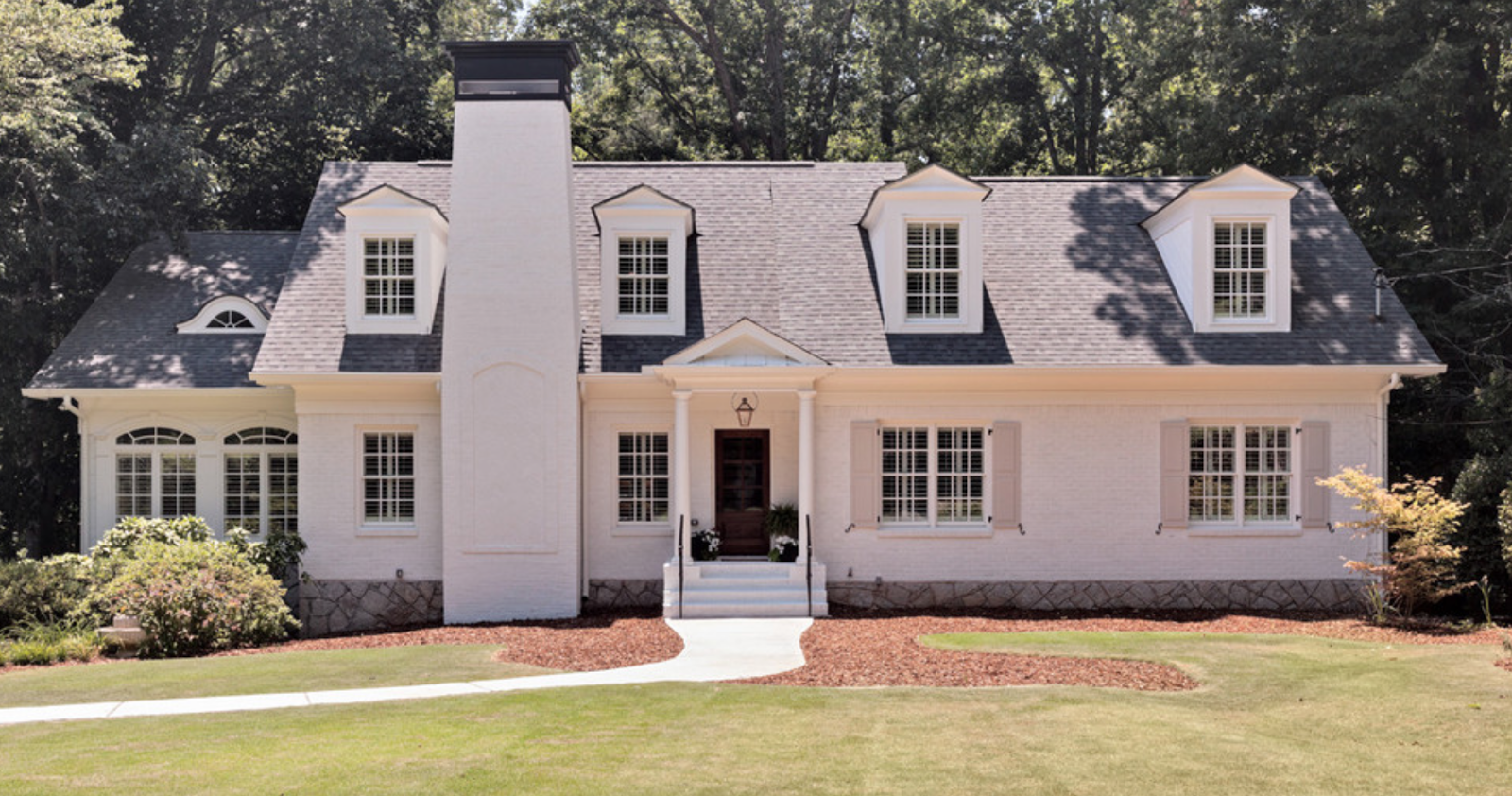
Dormers added and front porch/entranceway.
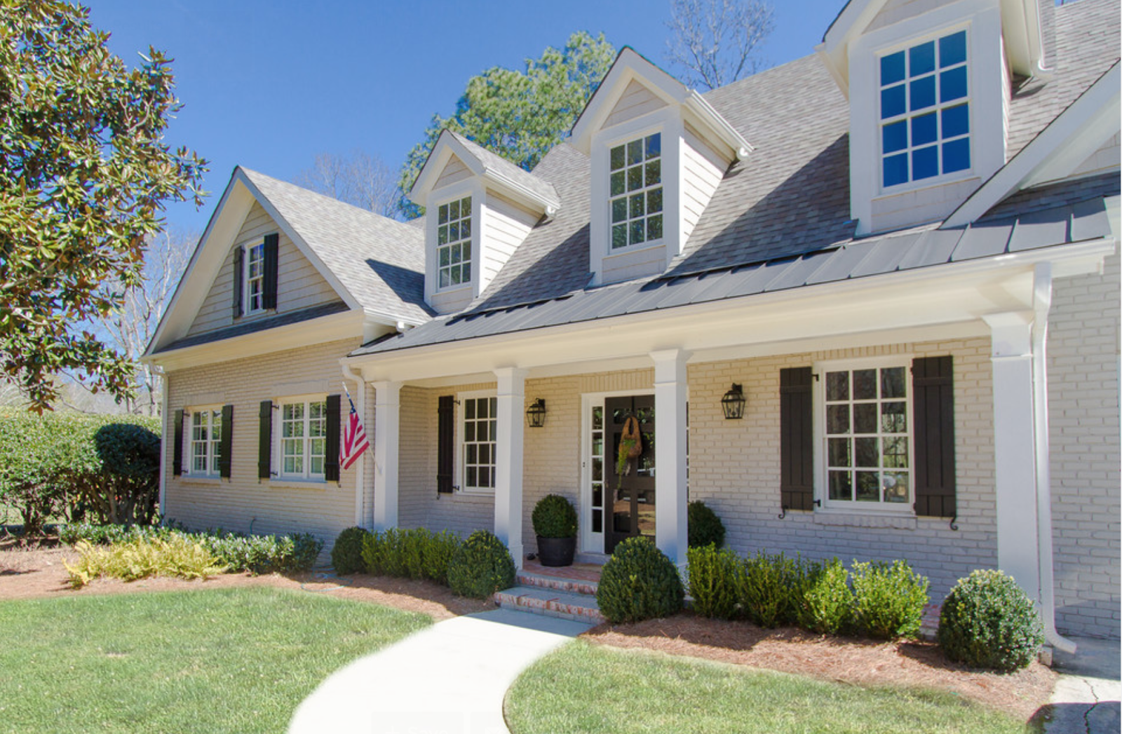
You can tell this was a tiny home. A few dormers and adjustments fit this small lot perfectly.
Small front porch with columns helped add some visual appeal to 2nd story addition.
Wednesday, May 14, 2014
Bright and Airy Kitchen
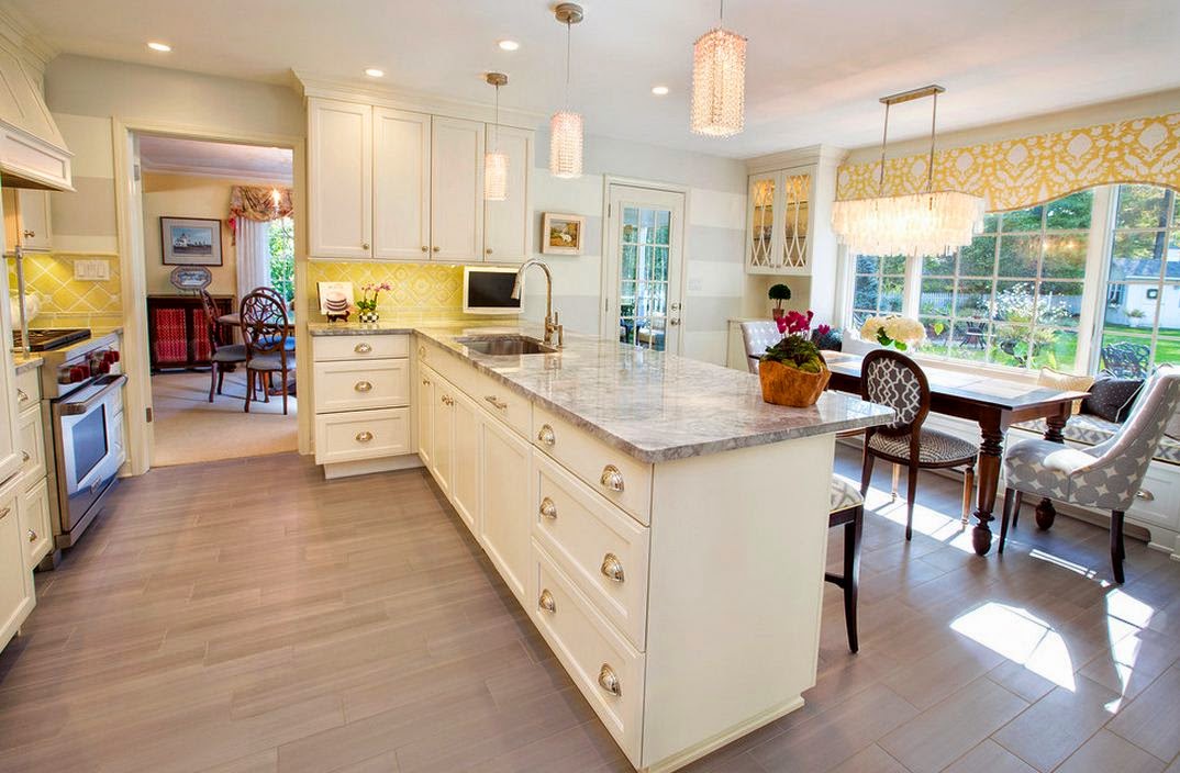
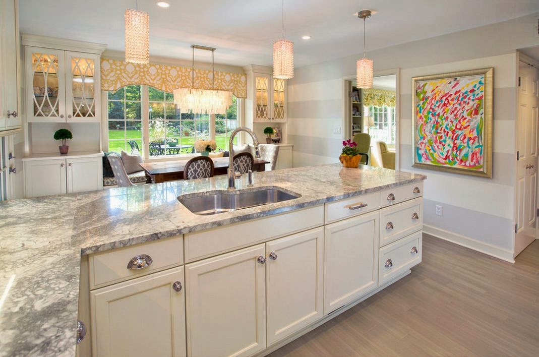
A while back I completed a large commissioned painting for an interior designer's own kitchen. Her kitchen is bright, clean and airy, so she wanted a colorful painting that had similar characteristics. Below are some photos of the space and the framed artwork.
Painting by Jennifer Latimer.
Subscribe to:
Posts (Atom)


